
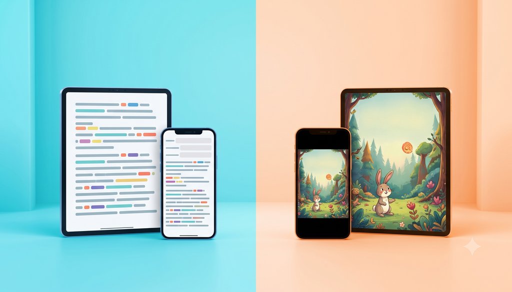
Summary: Reflowable layout is a liquid book: the text rearranges itself on any screen and the reader controls typeface, contrast and reading aloud. Fixed layout freezes the composition of the printed page, which suits illustrated children's books and comics. The choice between them determines accessibility, distribution and even cost. And if the book has to be accessible, the answer is almost always reflowable.
A publisher decides to release the digital version of a title, gathers the files, sends them over, and the first question we send back is nearly always the same: reflowable or fixed? It sounds like a technical detail. It is not. That single decision determines which screens the book will work on, whether a blind reader will be able to read it, how many ISBNs you will need to buy, and what the project will cost.
So it is worth understanding the difference before pressing the button.
Two ways for text to behave
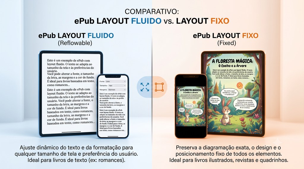
In the post about what an EPUB is I called the format a liquid book. The image still holds, and it is the best place to start. In reflowable layout, the content has no fixed shape. Just as water takes the shape of the glass, the text takes the shape of the screen: you increase the type size, switch to dark mode, change the typeface, and everything rearranges itself. The same file read on a computer, on a phone and on an e-reader, each in its own way.
Fixed layout (which we shorten to FXL) does the opposite. It freezes the page exactly as it was laid out for print. Each page becomes a kind of photograph: the position of the text, the images and the colours is locked in place. You turn pages, but you do not redraw them. It is, at bottom, the cousin of the PDF that got admitted to the digital bookstore club.
In practice, a fixed-layout children's book behaves like a sequence of slides: a full illustration per page, the text embedded in the artwork, the turn happening page by page. Handsome on a large screen. Rigid by nature.
When reflowable is the right choice
For most books, reflowable is not merely better. It is the only one that makes sense.
Novels, non-fiction, self-help, technical and academic books, any work of running text calls for reflowable layout. These are books people read for hours, often on a phone, on the bus, at night with the light off. The reader needs to be able to increase the type size, choose a more comfortable typeface, turn on high contrast. Locking that into a fixed composition would be like selling a one-size shoe and telling the customer the problem is their foot.
That is why practically the whole commercial text catalogue, from the large publishers to the independents, comes out reflowable. It is not chance: it is the format that respects the reader.
When fixed layout is justified
Fixed layout exists for a good reason. There are books in which the composition is not the wrapping, it is the content. Moving the text would destroy the work.
These include:
- Illustrated children's books, where the illustration fills the page and the text is in conversation with the artwork.
- Comics, manga and graphic novels, where the order of the panels and the speech bubble in the right place are the narrative itself.
- Art books, photography and catalogues, where the graphic design is the product.
- Cookbooks, atlases and highly visual textbooks, where the relationship between image and text is exact.
- Concrete poetry and experimental work, where the position of the word in the white of the page is the poem.
In those cases, letting the text "flow" would throw the author's intention away. Fixed layout preserves the designer's work. It is the right tool for the right problem.
To be honest, it is the decision that causes the most argument here. What is lovely to leaf through is not always what serves the most people, and that tension turns up in almost every illustrated project.
The point that changes everything: accessibility calls for reflowable
Here is the part I would ask you to read carefully, because it is where most decisions go wrong.
Fixed layout is, technically, a pile of page-images. And an image, to a screen reader, is a dead end. The blind reader using a screen reader, the reader with low vision who needs to enlarge the type, the teenager with dyslexia who needs more spacing: none of them can do any of that in a locked file. At best the software reads nothing. At worst it reads broken fragments, in the wrong order, with code debris in the middle of the text. I have seen it happen, and it is not pretty.
Reflowable layout is what makes accessibility genuinely possible: navigation through semantic landmarks, speech reading in the correct order, control of typeface and contrast, text that reflows. Everything EPUB 3 was designed to do only works properly in reflowable.
How many blind readers are you willing to leave out? How many older readers who need 22-point type? How many people with dyslexia? When the answer is "none", the format chooses itself.
So the rule at Booknando is simple: if the book has to be accessible, it is reflowable. That is not a preference, it is a consequence. Which is why what gets delivered to the PNLD programme is reflowable, why public digital libraries work in reflowable, and why accessibility legislation, in Brazil and abroad, is pushing the whole market in that direction. I wrote about this in the piece on accessibility as what really sets digital books apart.
And what about the illustrated children's book, which almost always has to be fixed? It is not left out of the conversation. The answer is to take real care over the image descriptions (well-written alt text, following the NBR 16452 standard) and, where the project allows, to produce an accessible reflowable version as well. Fixed layout is not an excuse for skipping accessibility. It is a case where accessibility takes more work, and we make up for it with image description.
What this changes in practice: ISBN and distribution
Two operational consequences catch a lot of people out.
The first is the ISBN. Reflowable layout needs one digital ISBN. Fixed layout, when it goes to Amazon, needs two: one for the fixed-layout EPUB and another for KPF, Amazon's current format for fixed books (the old Mobi is long dead). If your reflowable file goes to Amazon, it does not need KPF.
The second is the source file. Fixed layout depends on a faithful composition, and the best starting point is the InDesign package, with fonts and high-resolution images, plus the reference PDF. Sending only a compressed PDF is a recipe for a poor result.
A quick guide to deciding
If you are unsure, answer in this order:
- Does the book have to be accessible, is it for a public tender or for a library? If so, reflowable. End of discussion.
- Is it running text, meant to be read for hours? Reflowable.
- Is the composition inseparable from the content (illustrated children's book, comic, art)? Fixed, with carefully written image descriptions.
- Still unsure? Reflowable is the safer bet in most cases, and the one that respects the reader most.
In the end the question is not "fixed or reflowable" in the abstract. The real question, the one to ask before anything else, is this: who is going to read this book, and on what screen? The honest answer almost always points to the format on its own.
If you publish books and want to get this choice right without rework, without losing accessibility or editorial quality, talk to us at Booknando. It is what we do every day, for large publishers and for independent authors.
My question to you is this: will the next title in your catalogue be designed to fit any screen, or will it go on being a handsome photograph that leaves some of your readers out?
Further reading
- Booknando. What is an EPUB: the difference between a PDF and a digital book. Available at: https://booknando.com.br/en/blog/what-is-an-epub/
- Booknando. Accessibility: what really sets digital books apart. Available at: https://booknando.com.br/en/blog/accessibility-true-differentiator-digital-books/
- W3C. EPUB 3.3 Specification (includes the fixed layout properties). Available at: https://www.w3.org/TR/epub-33/
- W3C. EPUB Accessibility 1.1. Available at: https://www.w3.org/TR/epub-a11y-11/
- DAISY Consortium. Ace by DAISY, an accessibility checker for EPUB. Available at: https://daisy.github.io/ace/