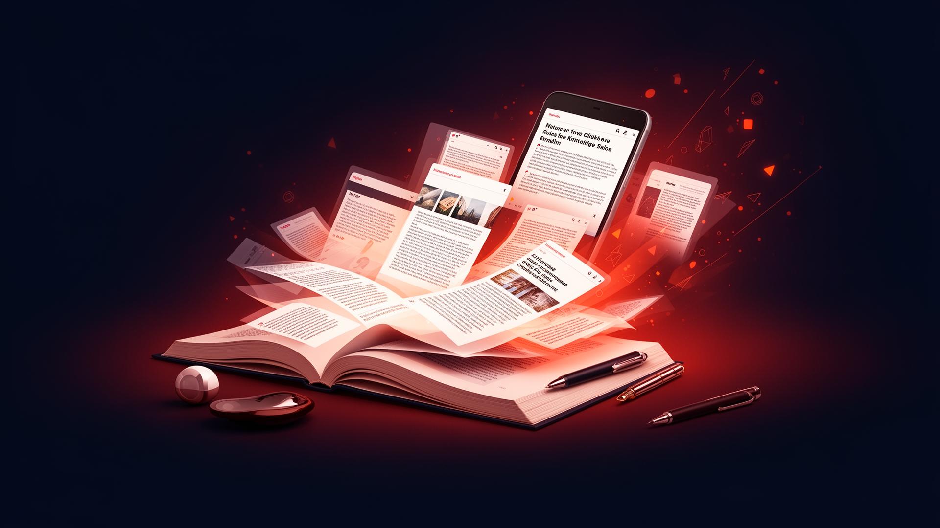

Summary: Accessibility is what really separates a digital book from a printed one. EPUB 3, with an architecture designed for inclusion, makes it possible to produce publications that serve every reader.
As the world moves further into digital, accessibility becomes what really sets a book apart. When we talk about digital books we are not simply talking about an electronic version of the printed one. We are talking about a rare chance to open reading up to millions of people who, for various reasons, run into barriers with traditional formats.
What a digital book really is
A digital book should not simply be an electronic replica of a printed one. Its essence lies in adapting to the reader rather than the other way round. Readers can change the type size, adjust contrast, choose the typeface that suits their eyes best, and move through the content in ways print could never allow.
That flexibility, built into the digital format, is what makes it genuinely powerful. When a digital book is produced properly it becomes a medium that respects each reader's individual needs, whatever their physical, cognitive or situational circumstances.
The problem of staying too close to print
One of the biggest obstacles to digital books maturing is the urge to reproduce the printed reading experience exactly. Many publishers still treat the digital book as a PDF copy of the original, keeping fixed layouts, set type sizes and visual structures designed solely for paper.
That approach is understandable if the aim is to preserve the editorial design, but it severely limits what the digital format can do. A fixed-layout book cannot be read comfortably on a phone, does not allow type adjustment, and is not compatible with assistive technology such as screen readers.
Rethinking the visual design
The look of a digital book need not be inferior to that of a printed one. It needs to be different. Designing for screens calls for a different mindset, one in which flexibility and adaptability are virtues rather than constraints.
With CSS3 available in EPUB 3, it is possible to create elegant, sophisticated designs that adapt to different screen sizes and reader preferences. Responsive typography, proportional spacing and clear visual hierarchy all make for a pleasant reading experience without sacrificing accessibility.
Embracing what digital can do
The real potential of the digital book shows itself once we let go of the print mindset and take up what only the digital medium offers. Navigation by chapter and section, full-text search, interactive bookmarks, notes synchronised across devices and dictionary integration all enrich the reading experience in ways paper cannot.
For educational material the range is wider still. Embedded audio for pronunciation in foreign languages, demonstration video in technical manuals, interactive exercises with immediate feedback, and content that adapts to the student's level are only a few examples of what the digital format allows when it is used well.
Design and usability made for digital
Designing an accessible digital book means attending to usability principles that go beyond how it looks. The document structure has to be semantic, with a heading hierarchy that supports navigation by chapter and section. Images need meaningful alternative descriptions. Tables need identified headers. The reading order has to be logical and coherent.
These requirements, set out in the EPUB Accessibility specification and the WCAG guidelines, do not only benefit people with disabilities. They make the book better organised, easier to navigate and easier to use for every reader. A good heading hierarchy, for instance, lets any reader find the section they want quickly.
Accessibility and the will to read
Accessibility in digital books is not only a technical or legal matter. It is a matter of respect and inclusion. Millions of Brazilians with visual, hearing, motor or cognitive disabilities face daily barriers to information and culture. The accessible digital book has the power to take those barriers down.
A blind reader can listen to a digital book through a screen reader. A reader with dyslexia can adjust letter spacing and choose a specialised typeface. Someone with limited mobility can move through the book using voice commands or adaptive devices. Every accessibility feature put in place is a door opened for a reader who was previously shut out.
Brazil's national textbook and teaching material programme (PNLD) recognises this by requiring digital educational material to meet accessibility criteria. That regulatory requirement reflects an understanding that inclusive education depends on producing accessible content.
In closing
Accessibility is not an optional extra in a digital book. It is what genuinely sets the format apart from print. When a publisher decides to produce accessible digital books, it is not merely satisfying technical or regulatory requirements. It is widening its audience, improving the reading experience for all its readers, and contributing to a more inclusive society.
EPUB 3, with an architecture designed around accessibility, gives publishers every tool they need to produce genuinely inclusive digital books. The challenge now is one of mindset: to stop thinking of the digital book as an inferior version of the printed one and start seeing it as a medium with its own transformative potential.
Booknando specialises in producing accessible digital books in EPUB 3. If your publishing house wants to turn its content into genuinely inclusive publications, get in touch.